San Antonio Regional Hospital Website Redesign
San Antonio Regional Hospital’s Population Health department serves diverse audiences—patients, teens, families, educators, and community partners. The legacy website carried valuable content but lacked discoverability, clear pathways, and modern accessibility. I redesigned the experience to make programs easier to find, participation simpler to start, and outcomes clearer to understand—while aligning with hospital standards and a welcoming, community-first tone.
00

problem
The current Population Health content is embedded within a broader hospital site built for static information—services, directories, billing, and records. That structure dilutes outreach where momentum matters. Programs like HCI, workshops, and screenings are scattered across deep navigation, making discovery slow and participation uncertain. Events read like archived pages instead of living commitments, with limited space for bilingual messaging, clear CTAs, or mobile-first scanning. Teams remain faceless, which weakens trust for teens, parents, and community partners who need to know who to contact. Operationally, updates require wrestling with non-modular templates, so staff can’t keep pace with real-world schedules. Accessibility is inconsistent and PII-sensitive touchpoints aren’t optimized for quick, safe intake. In short, the department’s community energy is flattened by a system designed for permanence, not outreach—necessitating a dedicated, action-oriented website with its own IA, components, and governance.
solution
I redesigned the Population Health website as a coherent system that turns curiosity into participation. The solution combines a high-contrast, mobile-first UI with program-centric navigation, bilingual access, and modular content so staff can keep it fresh without rebuilding. • Bold contact-first hero: The green, high-contrast contact form anchors every page, reducing the steps from interest to inquiry. It’s intentionally human, paired with community imagery to signal warmth over clinical distance. • Events as a gateway: A featured event card sits atop a structured list and a “View full calendar,” balancing immediacy and discovery. Dates, locations, and concise summaries are optimized for scanning, increasing click-through to registrations. • Mission in action: “What We Do” reframes Population Health around three pillars—Community Events, Youth Programs, and Partners—so visitors understand value in seconds and can jump straight into the right flow. • Trust through people: The team grid introduces real staff with role clarity and succinct credibility statements. This reduces misrouted inquiries and builds confidence among teens, parents, and partners. • HCI clarity and next steps: Program pages are standardized with outcomes, requirements, schedules, and Apply/Get Info/FAQ anchors. This structure reduces back-and-forth and accelerates enrollment. • Real impact, bilingual outreach: Collage storytelling and “Hable con un especialista” foreground language accessibility and lived community moments, making the site feel like a welcoming front door. • Accessibility + governance: WCAG-informed type and spacing, EN/ES toggles, and reusable modules (events, programs, team, impact) give staff a sustainable authoring model that preserves consistency and compliance. Together, these choices convert a content-heavy site into an action-oriented platform that reflects the department’s purpose: accessible health, visible programs, and easy ways to get involved—today.
Opening the Front Door to Community Health
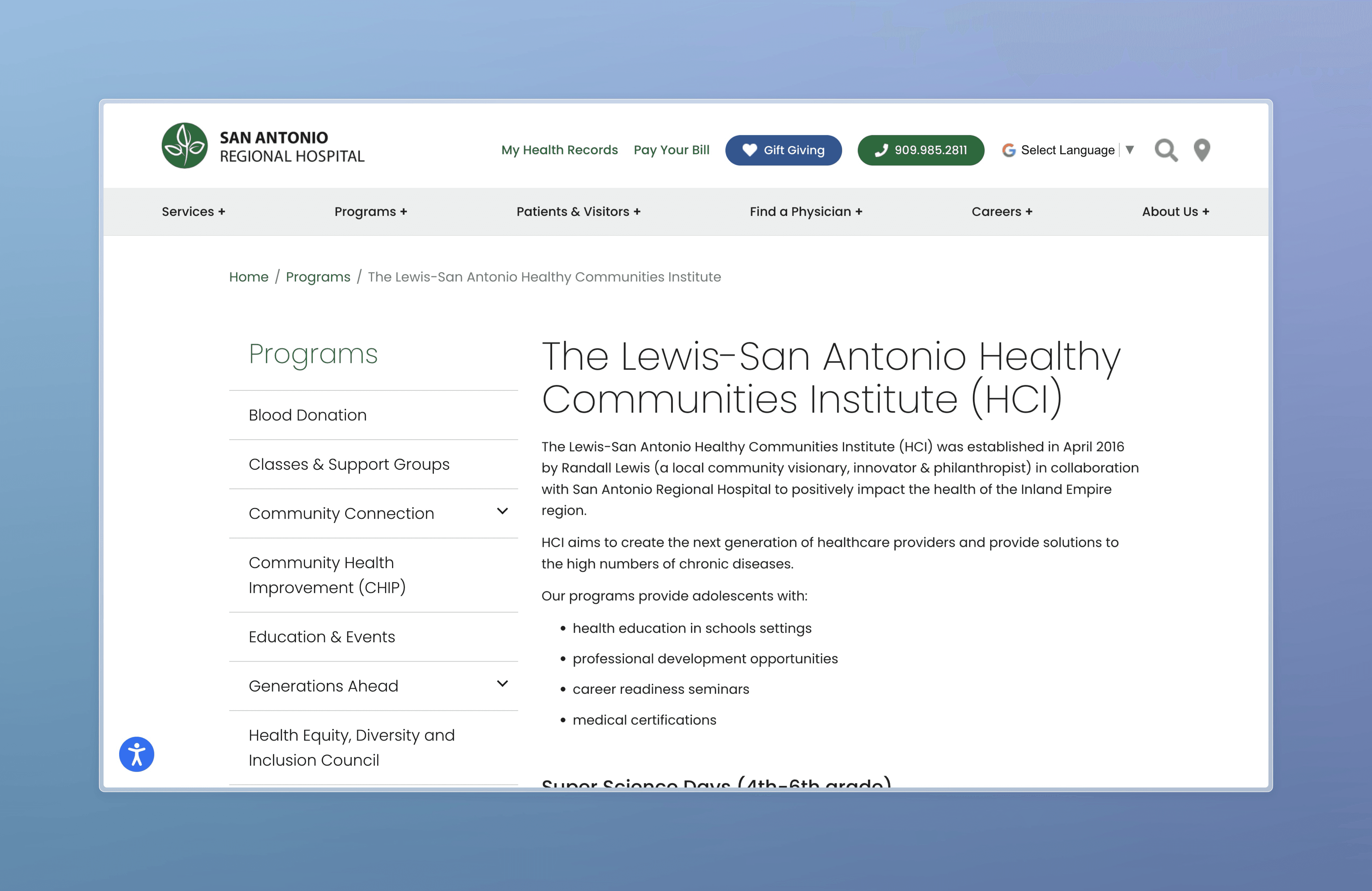
I redesigned the Population Health site to feel like a warm, immediate invitation—clear paths, human faces, and action right where curiosity starts. The contact-first hero makes getting help effortless, while a living events hub turns programs into visible momentum. A plainspoken mission with three pillars—Community Events, Youth Programs, Partners—anchors purpose and routes visitors to the right next step. The team grid builds trust through real people and role clarity, and standardized HCI program pages convert interest with outcomes, requirements, schedules, and Apply/FAQ anchors. Finally, bilingual real-impact storytelling shows everyday moments of care, making the site feel both welcoming and accountable. Underneath the warmth is discipline: WCAG-informed type and contrast, EN/ES toggles, and modular components staff can update without losing consistency or compliance.
year
2022-2023
timeframe
3 months
tools
Canva, Figma
category
Branding and Identity
01

The Population Health department was living inside a broader hospital website designed for universal information—insurance, records, services, directories. That framework is excellent for compliance and consistency, but it flattens the lived, local rhythm of outreach: workshops that move, programs that enroll, bilingual support that flexes, and teams that respond quickly. Content sat deep in navigation, events were treated like static pages, and program pathways (especially for youth) required too many clicks and too much context to understand. For a department built on relationships and action, a subpage wasn’t enough. We needed a dedicated site that could speak like the community it serves: immediate, human, and purpose-forward—while still honoring hospital standards.
02

The “What We Do” section speaks in plain language, then shows it. Community events, youth programs, and partner initiatives each get their own visual and copy block so visitors can understand value before they click. The previous structure blended mission with navigation; this reframing turns mission into movement. It’s not just what we believe—it’s what you can join today. By anchoring the page with an accessible manifesto, we guide people from purpose to participation without cognitive overhead.
03

Outreach is time-bound and momentum-driven, so the events hub elevates a featured program—the Emergency Preparedness Workshop with the American Red Cross—supported by clearly structured secondary listings and a “View full calendar.” Instead of burying dates in generic pages, we treat events like living artifacts: bold title, real locations, scannable details, and obvious CTAs. This design acknowledges that community members arrive with practical constraints—work schedules, childcare, transport—and rewards them with immediate clarity. It’s how a hospital becomes a neighbor.
04

A collage of everyday moments—learning at a table of markers, a specialist ready at a bilingual booth, laughter in a shared room—carries the tone of the site. The “Hable con un especialista” callout is deliberate: it centers language access as a doorway, not a footnote. Where the old design spoke formally, this section speaks intimately. These aren’t stock photos; they are invitations—evidence that participation looks like conversation, craft, and kindness.

05
Outreach is inherently human, so the team grid presents real faces, titles, and short credibility statements. This isn’t decoration—it’s infrastructure for trust. Families want to know who they’re emailing; partners want to see who owns a program; teens want to feel welcomed by people, not just logos. The prior approach hid the team in the “About” fold. Bringing them forward makes the site feel accountable and approachable, aligning institutional credibility with community care.
06

I ended the site with a bold, high-contrast contact hero—name, email, phone, and a simple comment field—set against a candid scene of people genuinely connecting. The story starts here because most outreach begins with uncertainty: “Is this for me? Where do I start?” By making contact the first interaction, we borrowed the warmth of a community center lobby and the efficiency of clinical intake. The green panel isn’t just color; it’s a visual promise of accessibility. This move reframed Population Health not as a directory, but as a responsive team you can reach in one click.
07
Designing a dedicated Population Health website felt like translating community energy into a digital home. The most valuable shift was moving from a directory mindset to an invitation mindset—contact-first, events as momentum, programs as clear pathways, and people front-and-center. Treating bilingual access, accessibility, and modular governance as core features (not add-ons) created a system that’s warm yet durable. The biggest learning: clarity builds trust, and trust accelerates action. When families see who to contact, what to attend, and how to join, participation becomes a natural next step rather than a leap.
08
Fragmented content: Program details and events lived across multiple pages and PDFs. I solved this by standardizing modules—events, programs, team, impact—so updates are quick and consistent.
Competing audiences: Teens, parents, educators, and partners have different needs. I designed pillar pathways with tailored CTAs and plain-language copy to route each audience without clutter.
Bilingual and accessibility demands: EN/ES support and WCAG compliance can inflate complexity. I built reusable components with baked-in type scales, contrast, alt text, and language toggles to keep standards effortless.
Operational sustainability: Staff need to update content without design debt. A lightweight design system and authoring templates helped maintain tone, hierarchy, and compliance.
Institutional tone vs. community warmth: Hospital credibility can feel formal. I balanced it with real photography, human copy, and visible team profiles, preserving trust while inviting engagement.