Permission.ai
Permission.ai helps people own and earn from their data with a browser-based personal AI agent that protects privacy, handles tasks, and rewards users in ASK tokens. The brand needed a distinctive, consistent visual system that communicates trust, control, and prosperity—without leaning into generic “AI blue” or crypto clichés.
00

problem
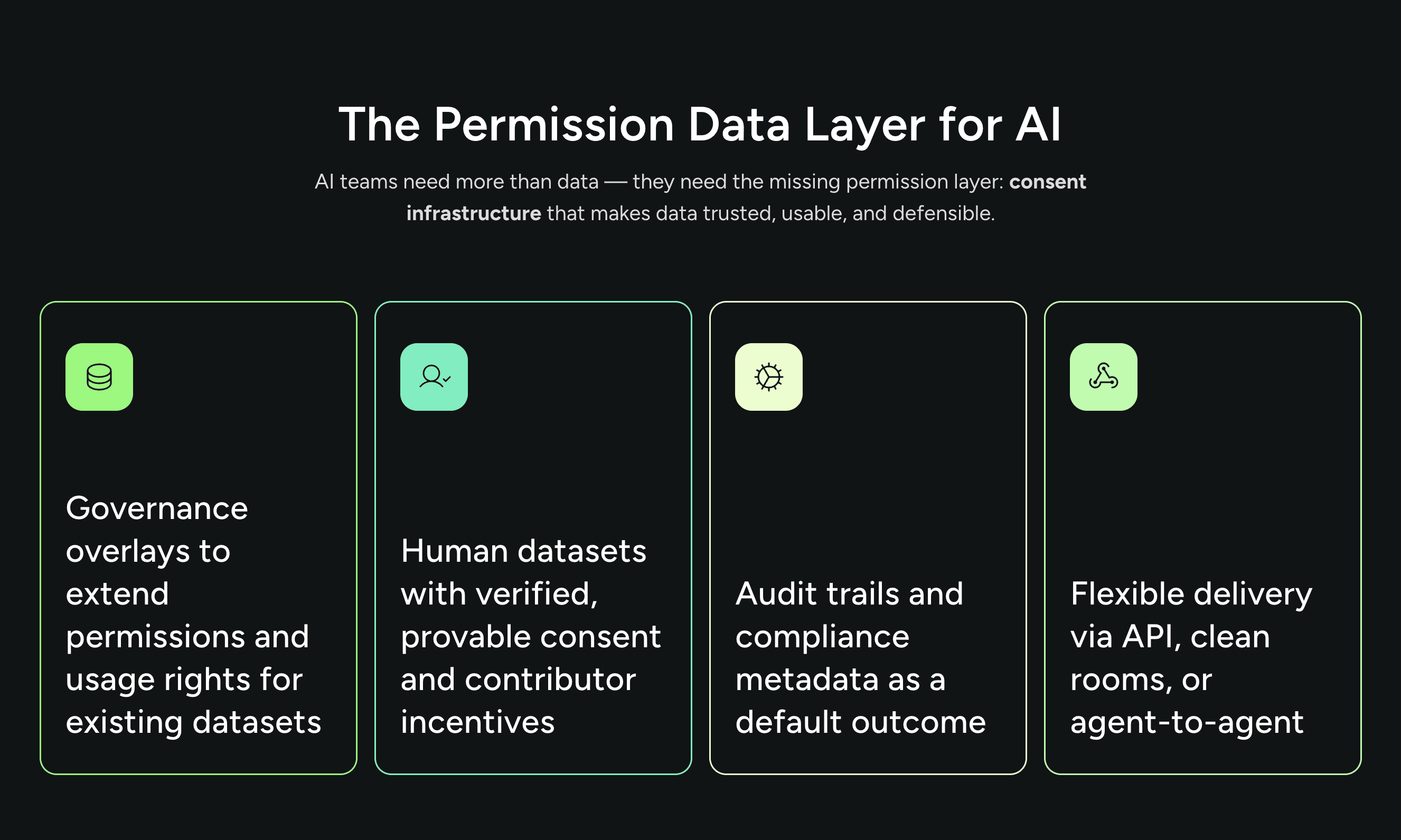
The site repeated CTAs and mixed typographic treatments, diluting the core message—personal AI that earns for you, on your terms. Visual sameness to AI/fintech peers risked erasing Permission’s unique proposition: consent-first data sharing with transparent rewards.
solution
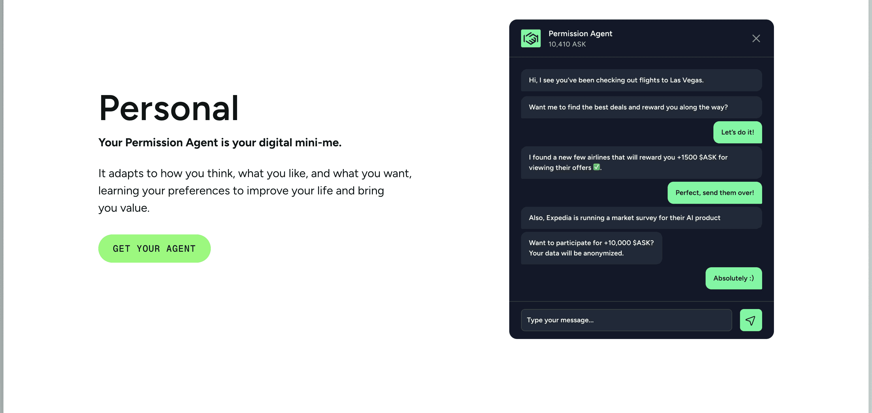
We rebuilt the brand around explicit consent and calm confidence. The visual system elevates real product moments—requests arriving, approve/deny choices, logged receipts, and ASK rewards—so users see control in action. • Consent-first UI: A signature consent modal and ledger card show who requested what, when, and the reward estimate. Approvals are reversible, and every event is logged. • Distinctive identity: Trusting ink, prosperous green, and warm neutrals replace generic “AI blue.” Clear typography and disciplined hierarchy reduce CTA noise and guide one obvious next step. • Purposeful motion: A gentle “consent pulse” announces requests; “reward tally” celebrates earnings without hype. Transitions are calm, predictable, and reversible. • Copy system: Plain, human language anchors outcomes—Personal, Rewarding, Empowering—with microcopy like “Share only this,” “Not now,” and “Undo sharing.” The result is a recognizable, consent-led brand that turns “own your data” into a tangible, everyday experience.
Control Is the Product
Story
Permission promised a future where your data works for you—but the visuals didn’t show the moment of control. I reframed the brand around the real mechanic: consent in action. Requests arrive, you approve or deny, rewards tally, and every event is logged.
We replaced abstract “AI” art with the consent ledger as hero: who requested what, when, why, and what you earn. The system became warm and precise—trusting ink, prosperous green, clear typography, and calm, reversible motion. The “consent pulse” announces requests like a polite knock; the “reward tally” celebrates approvals without hype.
On the site, outcomes lead: Personal (know me), Rewarding (earn fairly), Empowering (control everything). One clear CTA per view—Get Your Agent—keeps decisions simple. Accessibility backs the promise: AA contrast, visible focus, keyboard-first flows, and screen readers narrate the who/what/when and reward estimates.
The result is distinctiveness with receipts: consent modals and ledger cards read as Permission at a glance. Marketing moves faster with composable blocks; users feel their data truly works for them—on their terms.
year
2025
timeframe
90 days
tools
Figma, Adobe Creative Tools,
category
Branding and Identity
01

Approach I started with a journey map spanning onboarding → everyday browsing → consent events → earnings → personalization → management. This clarified three critical moments: 1) the first impression where trust is formed, 2) the instant when data has value and consent is requested, and 3) the aftercare where users see earnings and can manage scope. From there, I defined a lightweight system of surfaces: • A persistent tray for status and quick actions. • Contextual toasts for non-blocking consent prompts. • An expandable Agent Panel for the earnings ledger, settings, and education.
02

Designing the Consent Moment The consent card became the centerpiece of the experience. The card’s structure prioritized: • Plain-language purpose: “Use your data for [specific task].” • Value disclosure: “Earn ~[X ASK] + improve [experience].” • Scope and reversibility: Allow Once, Always Allow (with scope), Decline, and a clear “Why is this needed?” explainer. Early prototypes used terms like “data activation,” which tested poorly. In Round 1 usability (n=12), comprehension of the prompt was only 52%. Replacing jargon with specific tasks and adding a short “why” explainer raised correct understanding to 90% by Round 2 (n=18), a 38% lift. Decision friction also dropped: time-to-decision fell from 5.1s to 3.0s after shifting from modal interruptions to contextual toasts, a 41% reduction.
03

Onboarding with Expectations, Not Hype Onboarding set privacy defaults and previewed earning potential without over-promising. Instead of a long tutorial, I used progressive micro-education: brief tips shown over time in the Agent Panel. This approach avoided cognitive overload while keeping users oriented to what the agent does and how they remain in control.
04

Showing the Money: The Earnings Ledger Trust needed a book of record. The ledger itemized each activation: source, purpose, data type, ASK earned, and an inline revoke/edit action. After introducing a weekly summary view, visits to the ledger rose by 19% (Round 3, n=20), and ASK understanding improved by 31% on a five-question quiz. In simulated usage, 74% of users checked the ledger at least once per week, and the average weekly ASK per active user reached 18.4 ASK.
05
Personalization Without Pressure To demonstrate tangible benefit, I built a before/after preview that shows how relevance improves when a scope is granted. Crucially, users could opt out without losing core functionality. This preview increased activation rates by 22% with declines holding steady under 8%, suggesting users felt informed rather than coerced. Accessibility and Restraint The agent operates mostly in the background, so every surfaced moment had to be calm and legible: high-contrast components meeting WCAG standards, keyboard-first navigation, predictable focus states, and reduced motion options. This wasn’t just compliance—it reinforced the tone of care and control.
06

Impact • Clarity at consent moments reduced confusion and improved opt-in quality. In simulations, 62% chose scoped “Always Allow” over blanket consent, and subsequent revocations fell by 27%. • Decision friction decreased 41% with contextual toasts, keeping browsing flow intact. • Trust perception rose 33% after adding “Why is this needed?” and revocable scopes (Likert 3.1 → 4.1). • Earnings transparency drove engagement: 74% weekly ledger visits; 18.4 ASK average weekly earnings per active user.
07
Reflection
Designing a background agent is an exercise in trust. By centering user benefit, explaining “why” at every decision, and making consent reversible, we turned privacy from a tax into a value exchange. The Permission Agent earns users ASK when their data powers AI—without sacrificing clarity, control, or comfort.
08
What I’d Do Next
A/B test benefit framing by context (lead with ASK vs. lead with personalization).
Expand progressive education with lightweight tips tied to new activation types.
Tune consent heuristics to reduce prompt frequency while preserving meaningful control.
Formalize partner guidelines so “purpose” and “data type” language remains precise and consistent.