AiTudier
AiTudier is the educational system designed for easy management of a school great functionality, comfortable space and easy customization.In this platform, students and teachers can join in a class and manage everything.
00
problem
Poof’s store pages were visually dense and inconsistent, making it hard for shoppers to quickly parse key product information and for the team to ship updates without rework. There was weak typographic hierarchy, overlapping component patterns, and fragmented decision-making across stakeholders, which led to scope drift and confusion around the MVP.
solution
Establish a coherent design system that sharpens hierarchy, standardizes repeatable layouts, and becomes a single source of truth for designers and engineers. The system anchors on Inter for typographic clarity, an expanded brand palette for contrast and messaging, and a maintained component library to ensure consistency from exploration through delivery.
AiTudier's Story
Story
AiTudier started with a messy reality: admins, instructors, and students were bouncing between tools to submit requests, track progress, and share updates. Every handoff added friction; every platform switch increased the chance of miscommunication. We set out to create a role‑based dashboard that streamlined the essentials and gave each user a clear, consistent way to move work forward.
We began with listening—mapping pain points across stakeholders and defining a tight MVP to stop scope creep. From there, the system came first: Inter for legibility at small scales, an expanded palette to create contrast and clear messaging, and a component library that acted as our single source of truth. Similar layouts repeated across dashboards so users didn’t have to relearn patterns.
Prototypes focused on glanceability: can a dean see status at a glance, can an instructor resolve a request without hunting, can a student understand next steps immediately? Iterations emphasized typographic hierarchy, predictable placements, and states documented in the library. The turning point was when the same component spec guided both design and build—collaboration sped up, and the dashboards felt calm and intentional instead of crowded and reactive.
year
2022
timeframe
3 months
tools
Figma
category
UI/UX
01

**Competitive Analysis** We examined leading education platforms and collaboration tools to understand where AiTudier must differentiate. Three consistent gaps emerged: 1) Fragmented Workflows - Many platforms split requests, messaging, and task tracking across separate modules or external tools. This leads to missed updates and “where do I find that?” moments. - AiTudier response: Consolidate core actions (requests, messages, activity) into unified, role‑based dashboards with predictable placements. 2) Weak Typographic Hierarchy and Inconsistent Components - Dense pages with similar visual weight slow comprehension; components behave differently across contexts, forcing users to relearn patterns. - AiTudier response: Inter for legibility, strong hierarchy, and a maintained component library that enforces repeatable layouts across list and gallery views. 3) Limited Glanceability for Status and Next Steps - Stakeholders can’t quickly see project health or request states; status cues are buried or non‑standard. - AiTudier response: Clear status chips, bold secondary palette for messaging, and standardized “next step” modules to reduce decision time. 4) Accessibility and Contrast Gaps - Some competitors underperform on contrast and focus states, hurting usability in dense dashboards. - AiTudier response: Color contrast aligned with WCAG, documented focus/hover states, and semantic structure per component. Positioning - AiTudier prioritizes efficiency and collaboration through a system‑first approach: role‑specific dashboards, repeatable component patterns, and glanceable status at every level. The result is faster comprehension, fewer tool switches, and more reliable execution across teams.
02

Platform Architecture Objectives: • Improve glanceability so shoppers can identify price, availability, and key benefits in seconds. • Reduce friction for the team by unifying patterns into a shared component library. • Elevate brand presence with confident color contrast and contemporary tones while preserving accessibility. Approach: • Discovery: Heuristic audit of the current store page and competitor benchmarks; stakeholder workshops to define MVP scope and success criteria; translation of insights into a prioritized problem statement. • System First: Build and maintain a modular component library as a living artifact—document behaviors, states, and accessibility requirements; enforce reuse through code and design tokens. • Iterative Delivery: Ship a focused MVP to validate hierarchy and layout decisions, then expand patterns across the store experience.
03

Design System • Typography: Inter is the primary typeface for its neutral, Helvetica‑like tone and excellent legibility at small scales. Clear typographic roles (display, title, lead, body, metadata) create strong contrast and predictable scanning paths. • Color Palette: Starting from Poof’s core identity hues, the palette was expanded to serve complex UI needs. ▫ Primary shades: establish visual hierarchy across headings, prices, and CTAs. ▫ Bold secondary palette: delivers clear messaging, alerts, and promotions. ▫ Vibrant tertiary tones: provide contemporary accents that stand out without overwhelming content. • Component Library: A maintained library throughout design and development—cards, media galleries, pricing modules, badges, CTAs, tabs, filters, and messaging banners—served as the single source of truth for all roles, ensuring predictable behavior and visual consistency. Page Architecture: • Storefront (Home): A centralized hub that surfaces featured products, categories, and time‑sensitive promos with quick‑reference tiles for fast scanning. • Product Detail: A standardized layout that prioritizes gallery + essentials (title, price, availability, key benefits), followed by detailed specs, reviews, and related items. Components are reusable across list and gallery contexts. • Request/Support Modules: Contextual sections for shipping, returns, and FAQs use the same hierarchy and component patterns, reducing cognitive load and improving completion rates.
04
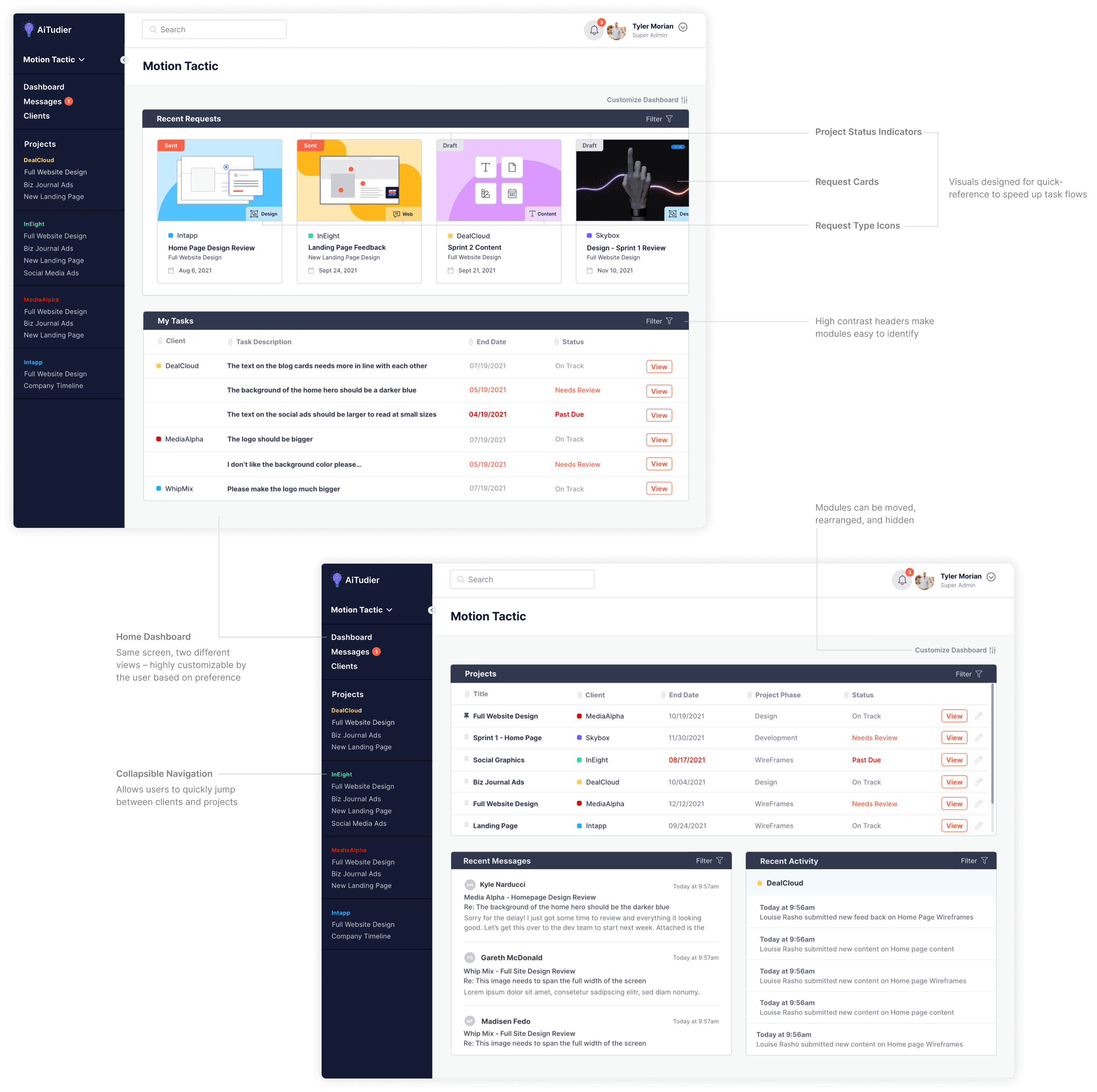
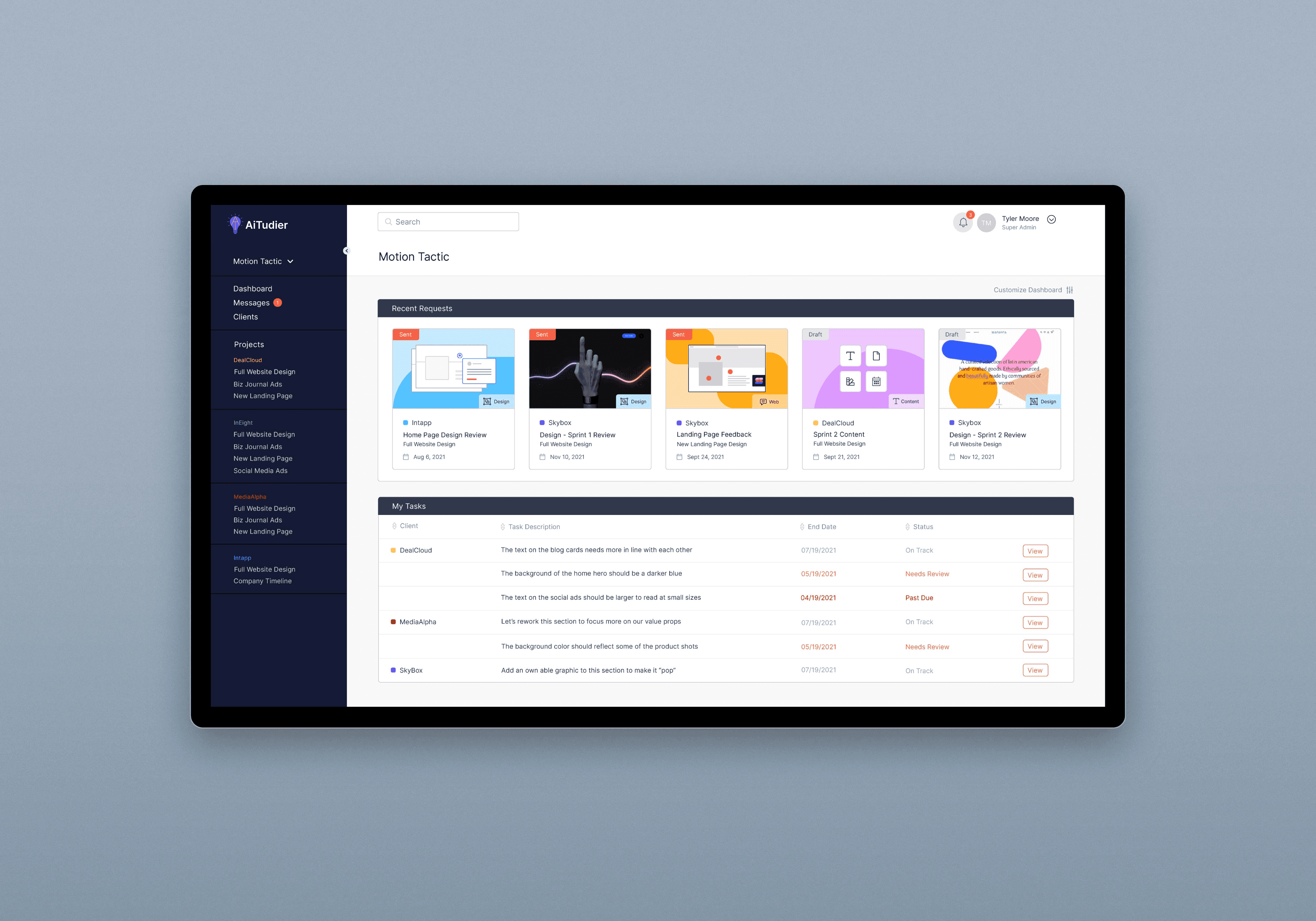
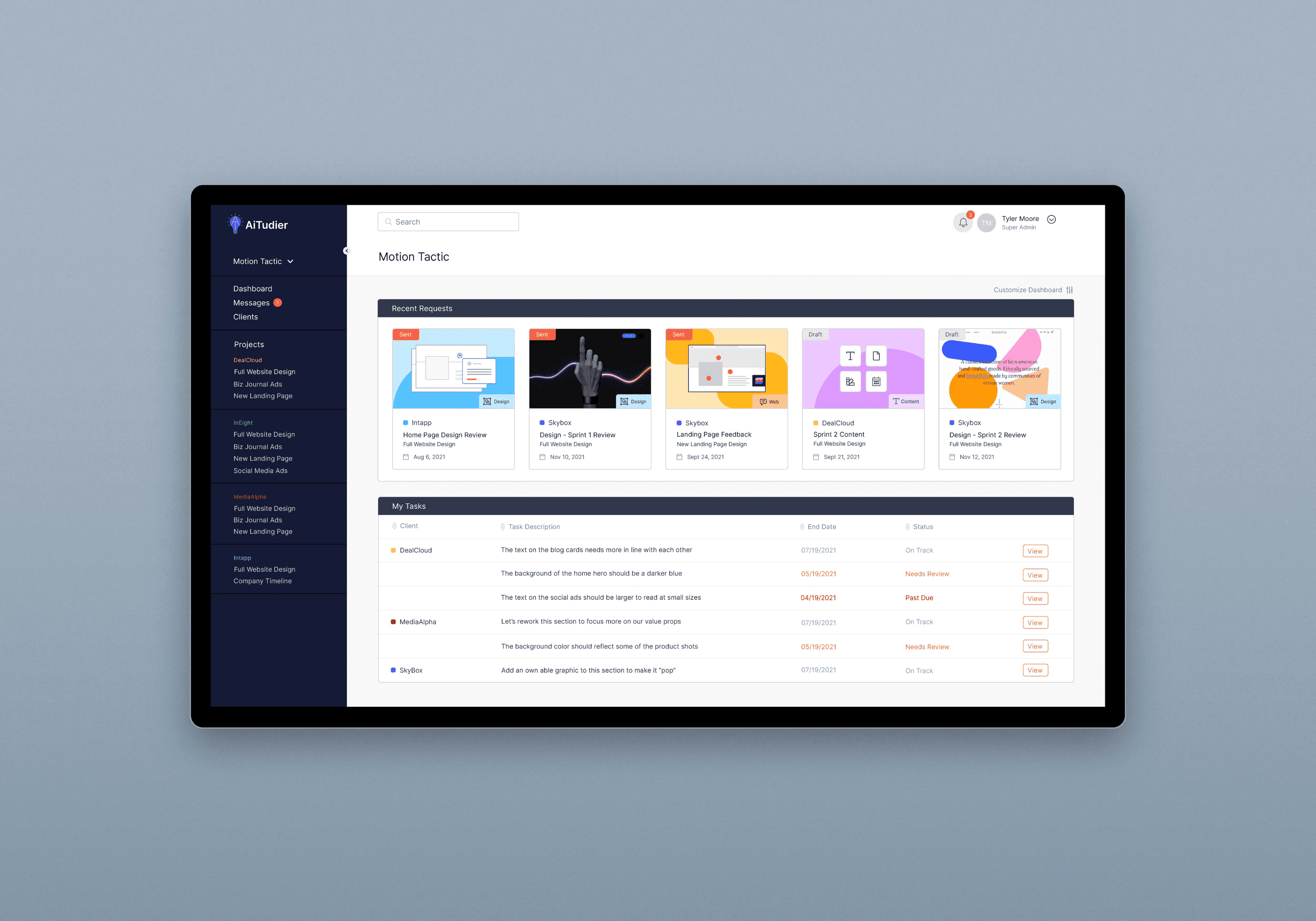
Home Dashboard A centralized hub that surfaces every project and its current status at a glance. Key elements include: • Status overview: Role‑specific cards (Admin, Instructor, Student) summarize projects, requests, and deadlines. • Priority cues: Color‑coded chips and icons highlight overdue items, blockers, and approvals needed. • Quick actions: One‑click entry points to create a request, reply to a message, or update a task. • Glanceability: Clear typographic hierarchy and consistent placements (title → status → action) reduce scanning time.

05
Single Project A focused space to manage all activity within one project without switching tools. It includes: • Unified activity feed: Requests, messages, and updates displayed in chronological order with filters for type and status. • Dual layouts: Toggle between list and gallery views to match user preferences and task types. • Scoped messaging: Threaded conversations anchored to the relevant request or asset to avoid cross‑talk. • Context panels: Sidebars for participants, milestones, and linked documents so details are accessible without losing place.
06

Single Request Purpose‑built layouts tailored to the type of request and user needs. It offers: • Request templates: Standardized fields and states (draft, submitted, in review, resolved) keep work consistent. • Layout options: Compact forms for quick approvals; rich layouts for complex tasks with attachments and dependencies. • Next‑step clarity: Prominent “owner,” due date, and required actions; status chips update in real time. • Auditability: Activity log and decision history improve transparency across stakeholders.
07
Component Library
The backbone of design and build, ensuring consistency and speed across dashboards:
Tokens and rules: Typography scales, color roles, spacing, and interaction states documented and enforced.
Reusable modules: Cards, status chips, badges, tables, tabs, filters, banners, CTAs—all with defined behaviors.
Accessibility baked in: Contrast, focus states, and semantic structure included per component to meet WCAG targets.
Single source of truth: Designers and engineers reference the same specs, reducing one‑off variants and rework.
Design System Foundations
How the visual language supports comprehension and collaboration:
Typography: Inter selected for neutral tone and legibility at small scales; roles (display, title, body, metadata) create clear scan paths.
Color palette: Expanded from brand hues to primary/secondary/tertiary roles for hierarchy, messaging, and accents.
Pattern consistency: Similar component layouts repeat across dashboards so users never have to relearn the UI.
Outcomes (Qualitative)
Faster comprehension: Stakeholders identify status and next steps with fewer fixations.
Reduced friction: Consolidated workflows limit context switching and miscommunication.
Build velocity: Teams ship changes faster thanks to reusable, do
08
Defining the problem was the hardest part. Stakeholder priorities shifted, and the MVP risked getting diluted. The turning point was aligning on role‑based dashboards and a system‑first approach—Inter for legibility, a clear palette for messaging, and a component library to codify decisions. We learned to over‑communicate scope, document trade‑offs, and protect repeatable patterns from “quick” one‑offs that create long‑term complexity. Collaboration improved once everyone could point to the same specs, and the product felt calmer, more intentional, and easier to evolve.


