Foundations - Journaling
‘A gym for the mind’. Foundations is an evidence-based B2B2C mental health app that offers a comprehensive library of exclusive, bite-sized tools and interventions designed to enhance mental well-being.
00

problem
Foundations users needed a simple, intuitive tool for tracking their moods, creating journal entries, and reviewing them. Traditional methods of mood tracking can be hard to make a habit out of, time consuming and challenging to monitor a effectively. We saw this as an opportunity to increase user adoption to encourage users to use the journalling feature as a "gateway" to the app, and to increase user engagement by encouraging users to return daily between the use of programs and activities.
solution
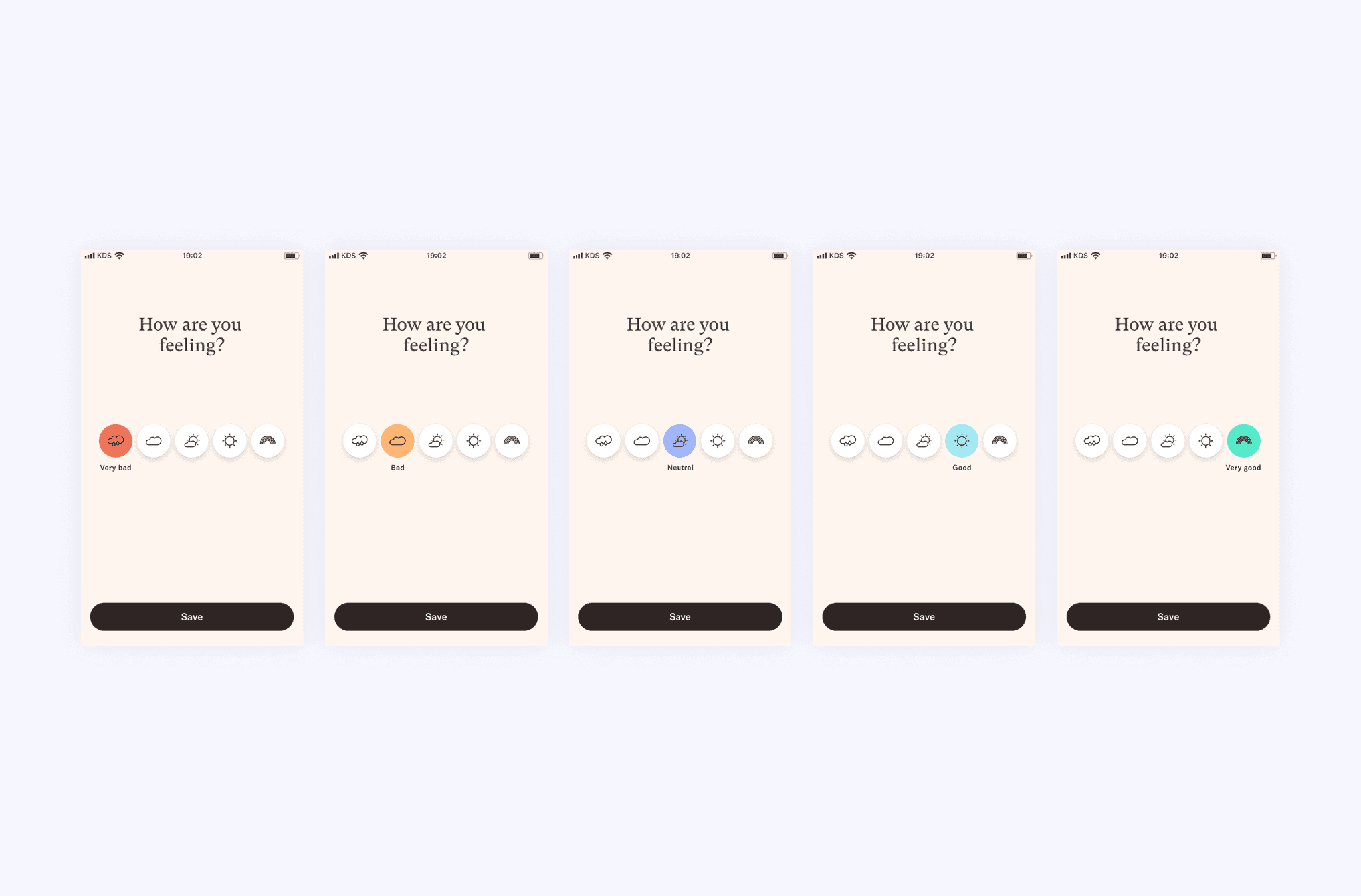
We built a habit-first journaling flow: log a mood in one tap, optionally add a short entry with guided prompts and tags, then revisit patterns in My Journey through timelines, calendars, and gentle insights. The UI emphasizes clarity and accessibility, pairing color-coded moods with text labels, supportive microcopy, and WCAG-compliant components. Privacy is explicit—clear edit/delete, export, and encrypted sync. Opt-in reminders encourage consistency without pressure. Concept testing confirmed expectations (add mood → optional entry → find in My Journey) and, within 30 days, delivered +5% adoption and +9% engagement.
It was time to let users take matters into their own hands with a new journaling feature.
Foundations users needed a simple, intuitive tool for tracking their moods, creating journal entries, and reviewing them. Traditional methods of mood tracking can be hard to make a habit out of, time consuming and challenging to monitor a effectively. We saw this as an opportunity to increase user adoption to encourage users to use the journalling feature as a "gateway" to the app, and to increase user engagement by encouraging users to return daily between the use of programs and activities.
year
2022-2023
timeframe
8 months
tools
Figma, Jira,
category
UI/UX
01

(02) Process: Discover I collaborated with user research and specialists to gather insights on journaling habits and mood tracking, and reviewed competitors' strategies and visuals to identify strengths and gaps. This combined research guided the foundational design for the mood tracker, aligning user habits with evidence-based practices.
02

(02) Process: Ideate I used research insights to define requirements for wireframes and designs, incorporating feedback from designers and stakeholders. I explored allowing users to easily log a mood, add quick journal entries, make these entries easily accessible and track the mood over time.
03

( 02 ) Process : Concept Testing Directing a concept study gathered user reactions, early product direction signals, and feedback on visual design, which aided me in choosing a direction. I explored user expectations for creating and retrieving inputs, revealing key preferences. We found that users wanted to add mood, have the option to add a written entry, expected to find results in the ‘my journey’ section.
04

( 02 ) Process: Proto Testing

05
(03) Solution Directing A concept study gathered user reactions, early product direction signals, and feedback on visual design, which aided me in choosing a direction. I explored user expectations for creating and retrieving inputs, revealing key preferences. We found that users wanted to add mood, have the option to add a written entry, expected to find results in the ‘my journey’ section.
06
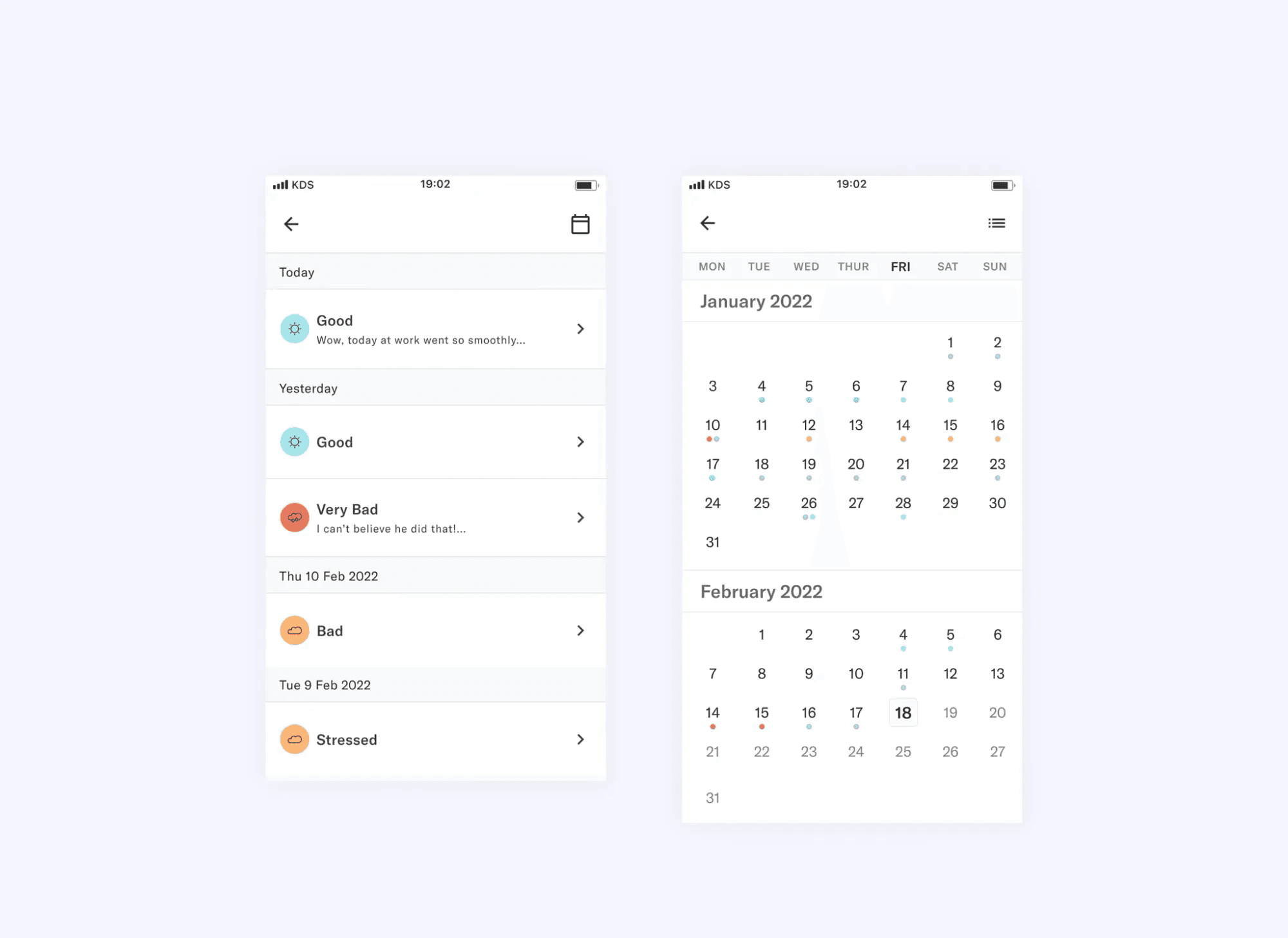
( 04 ) Wrapping Up After 30 days from release we found there was a 5% increase in user adoption, and a 9% increase in user engagement. Our users were happy.A journaling feature may seem simple however it had it's challenges. As a concept it is quite ambiguous. Concept testing allowed me to re-focus the direction when I went a bit to far exploring ideas. During this project I learned to combine user needs, scientific needs and business goals, and how to collaborate within a Design System and quickly align on key UI components.
07
Reflection
What worked
Remote-first navigation made the experience more predictable and reduced “decision distance” from Home to Play.
Moving Prime/Paid indicators to the preview banner preserved transparency without overwhelming users.
Shrinking the hero banner surfaced an extra content row, improving discoverability and scan speed.
What we learned
Transparency is a trust builder, but over-labeling creates cognitive load—contextual disclosure is more effective.
Season consolidation reduces page switching and keeps users in a single decision space.
Sidebar patterns map well to directional input, but iconography and labels must be tested for clarity.
08
Challenges
• Balancing curation with autonomy: recommendations must feel helpful without trapping users.
• Translating remote constraints into clean flows required careful click-count auditing.
• Aligning scope across “nice-to-have” features and MVP guardrails took multiple iterations.
Next steps
• Validate the sidebar’s adoption and Prime/Paid toggle through task-based tests (time-to-content, error rates).
• Fine-tune icon labels and sub-genre filters for faster wayfinding.
• Explore lightweight onboarding and progressive disclosure to help users adjust to the updated patterns.