Decreasing Decision Fatigue on Prime TV
Amazon Prime Video aims to provide multiple types of content for their streaming service, allowing themselves to differentiate from other competitors in the streaming service war. However, people using the smart tv platform found themselves struggling in navigating the application which results in people dropping off the platform much faster and therefore not being able to complete any sort of content provided to them. This leads to much lower engagement therefore lowering the retention in users over time. I led the redesign of the navigational experience, expediting the journey to their content so their decision making shortens the amount spent in looking for content they are interested in while also providing transparency so their journey does not feel like a fraud in the user's eyes.
00

problem
Navigating on the Smart TV is too cumbersome to get to desired content. Users felt too overwhelmed with the amount of content shown to them that they would leave the app within seconds. Users have also felt that there was a lack of transparency between its paid content and original content. Now business-wise, due to lack of retention of users as well as its engagement in its content, It is crucial that we limit the amount of content load to the user as well limit the amount of clicks to lessen the amount of decision fatigue.
solution
Validation Evaluating value propositions for navigating and finding content for users to be one less click away from their desired choice. I conducted a usability test with 5 users (2 were occasional Smart TV users while the other 3 were frequent users). First, I tested to see if people were able to navigate and find certain content that is currently available. Next, I assessed how they interacted with the sidebar to see if it was easy or difficult to use. After, I asked questions regarding the overall value of the navigation experience. Iterating after user feedback Based on what I learned from the validation phase I discovered these key steps to iterate on my current design. Moving the Prime/Paid Tag to be less overwhelming Users mentioned that the prime/paid tag is overwhelming to see on every thumbnail. To maintain transparency and be mindful of cognitive load, I moved the prime/paid tag to to the preview banner which leads to users only seeing this tag as they scroll through their desired content.
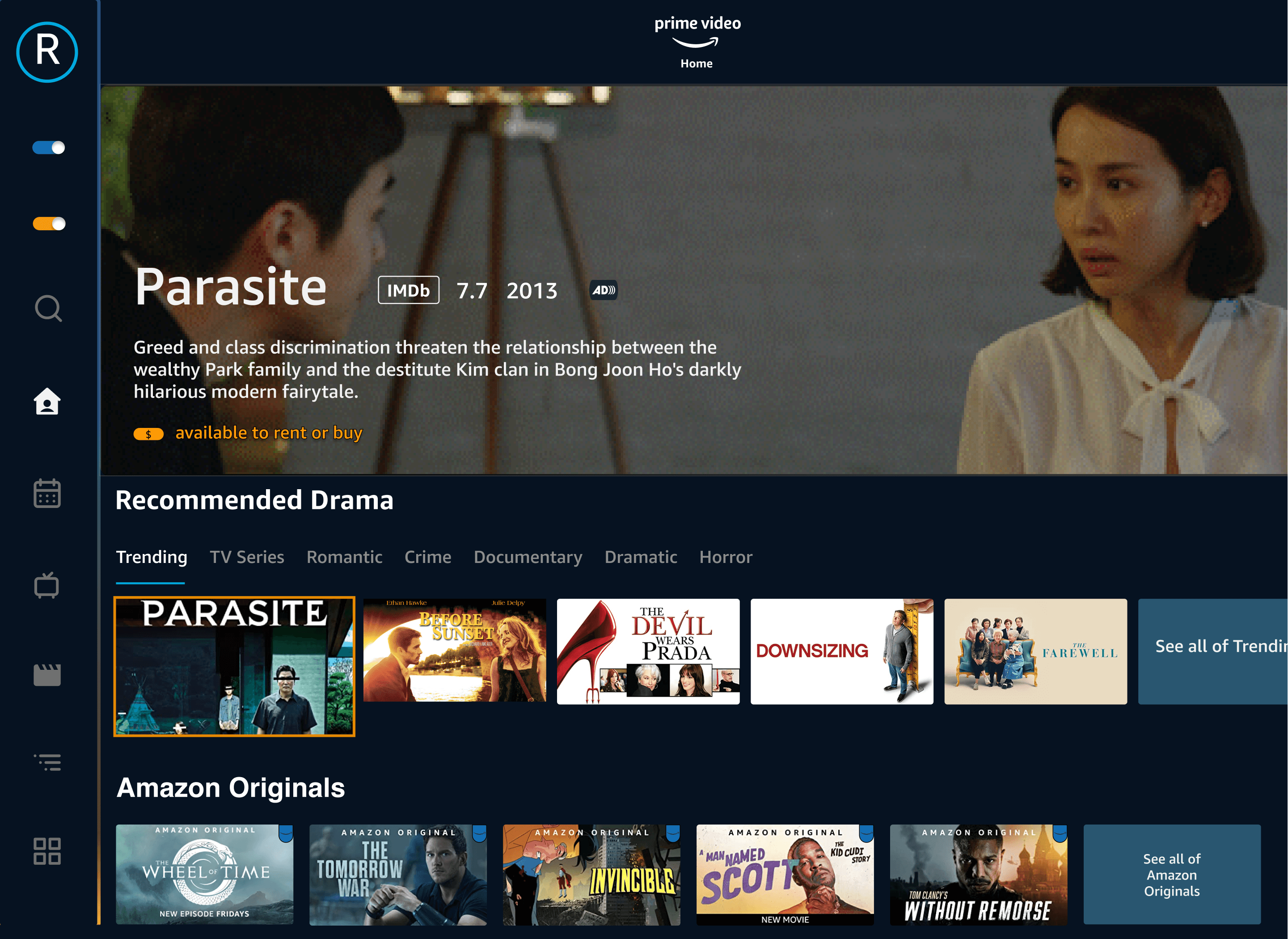
The current experience required users to to find content through a multiple series of clicks on the remote control that led to decision fatigue as time was wasted on finding certain movies/tv shows.
Users also found that they get mislead as they find certain content to have a paywall after their decision to watch was made.
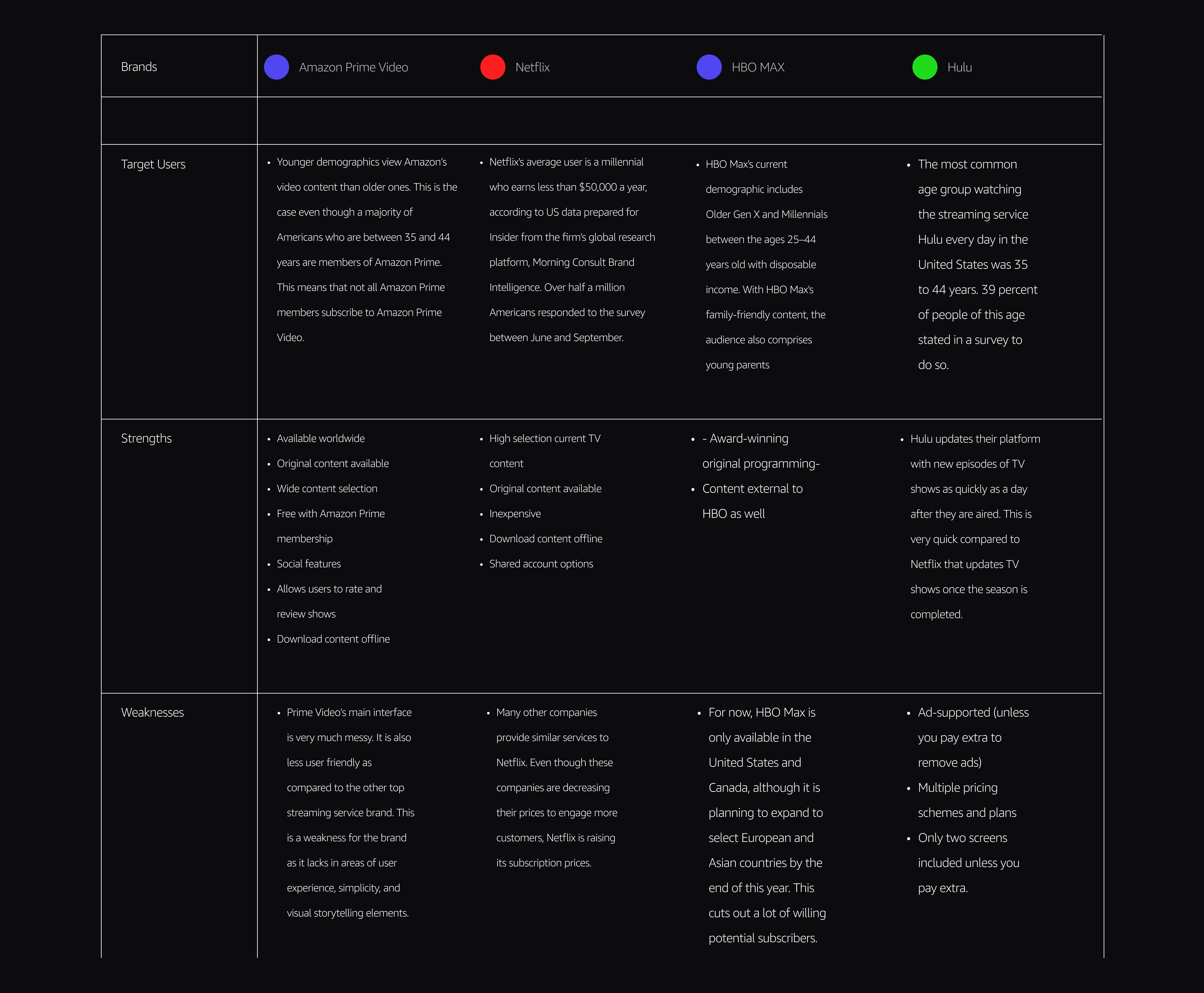
Competitive & Comparative Analysis
Competitive analysis was conducted to identify competitor's strengths and weaknesses to inform Prime Video's features and information structure.
year
2021
timeframe
90 days
tools
Figma
category
Personal Project
01

Current Prime Video Flow
02

Persona
03

User Flow
04

Low Fidelity Brainstorm Using the feedback and insights gained from research, analysis and sketching, explored how many clicks on the remote it would take for the user to navigate to a desired section of the design and whether it was reasonable considering time spent. Just below I uncovered different pathways of transparency as well as the organization of content to be much more discoverable.

05
06

Consolidated the feedback and expanded ideas and insights gained from research and analysis. Below I explored how content could be organized through sub-genres as well as expanding the organization of informational hierarchy.
07
Navigating the Expedited Journey
I tested the new iteration and there was a solid comprehension on the value of having a simpler navigation bar to access content faster and the option to toggle between Prime/Paid content.
Participants were satisfied in seeing recommendations that could be catered to them while having autonomy on deciding which sub-genre to choose from
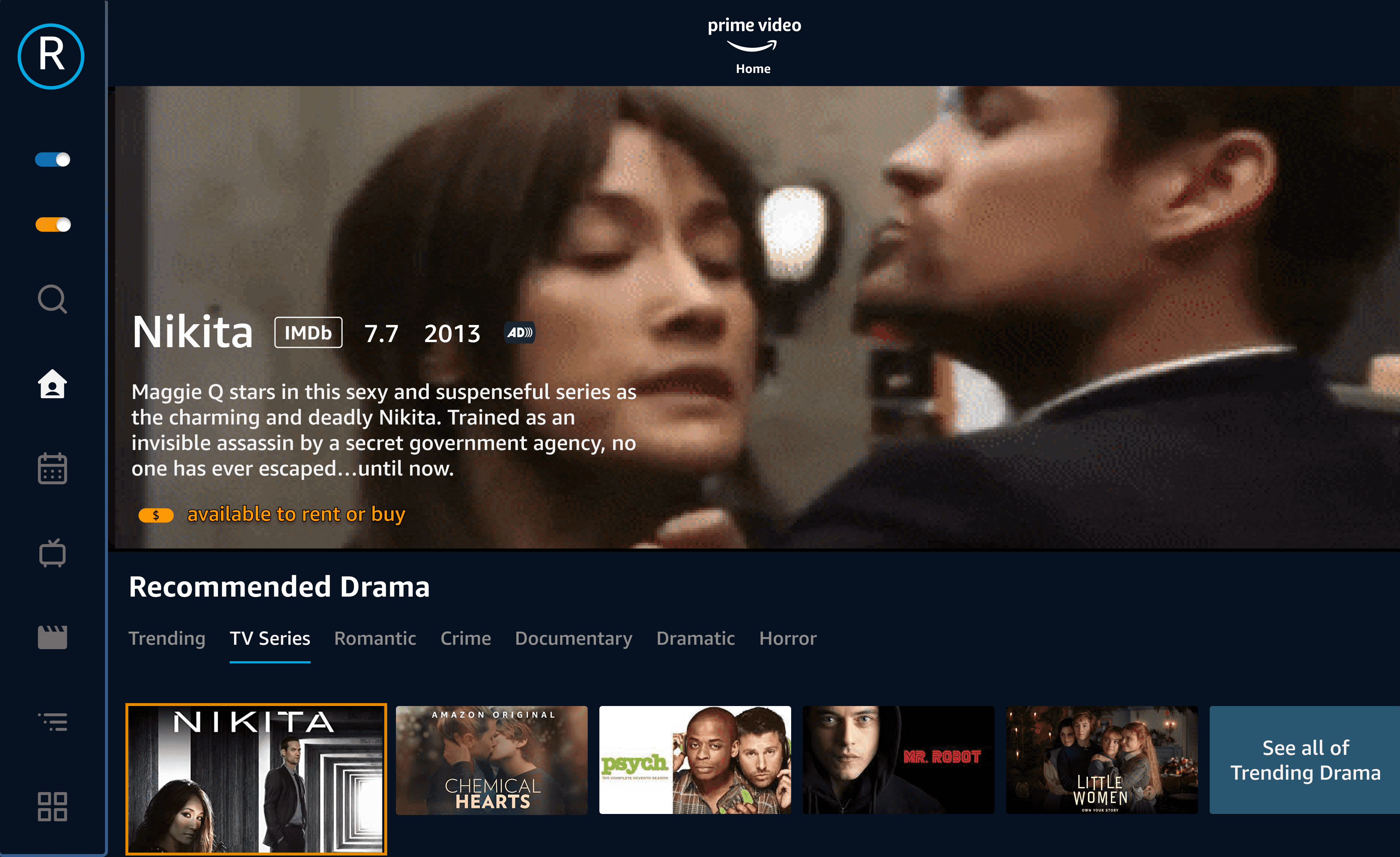
Find the indicator that people are interested in using the sidebar navigation that provides transparency options
1. A realistic plan for implementation focuses on prioritizing the transparency of content as well as adapting to a new navigation style for the smart tv.
2. If the transparency and the sidebar navigation is adopted, the next step is to move forward in organizing the information architecture as well as providing a recommended sub-genre feature to give both control and autonomy for users.
3. If user engagement continues, we can move towards implementing an onboarding process so users are not lost as they see the updates implemented throughout the application.
08
Calculating the Results
Weighing the value of expediting the smart tv experience
Despite the fact I currently don’t work for Amazon and won’t be able to see the metrics for this MVP, there are still KPI’s to find that will measure success.
what is x% decrease in average time spent in choosing content to watch
what is x% increase of user engagement with content on Amazon Prime
what is x% increase in Amazon Prime subscriptions as a result of being able to distinguish between paid/prime content
These metrics could help indicate whether the transparency and organization of content is successful.